Human mobility data and analytics at scale offer untapped prospects for studying, modelling, understanding, and visualising urban mobility and transport in unprecedented ways. In this post, we will try to answer the above-mentioned questions by looking at geospatial big human mobility data in general, and location data from micromobility service providers in Paris.
The first step in the analysis focuses on modelling velocity and trajectory distributions of mobility patterns extracted from data supplied by the micromobility service providers.
Advanced statistical methods are then employed to identify and extract micromobility trips from overall human mobility data. This can be a difficult exercise, as distinguishing pedestrians from cyclists or e-scooters is non-trivial due to overlapping distributions of velocities. We will cover this in an upcoming post.
The next step is to match the micromobility trajectories to the actual bike lane infrastructure and the existing street network - a process called map matching. Having conducted these steps, we can then count the number of micromobility trips through various street segments and visualise them as flow intensities:

We see thicker lines representing more micromobility trips along the Seine river, especially the northern banks; along the famous Rue de Rivoli; the Boulevard de Sébastopol connecting the Pont au Change bridge to the Gare de l'Est train station; close and around the Gare du Nord train station; as well as along the Avenue de Flandre in the northern 19th Arrondissement, among others.
Throughout the past decades, transportation planning and urban analytics have attempted to solve for data scarcity and develop methods to estimate or gauge traffic flows based on the structural characteristics of the urban fabric - without data on actual human mobility. Following classical traffic assignment models, forays into network theory have furnished urban analysts with a set of tools to evaluate streets and squares in terms of their potential to attract pedestrians, and, more recently, bikers. One such widely used analytic tool is the network betweenness centrality of a street segment: the share of shortest paths between all pairs of nodes in a network passing through that street segment. In simple terms, this means that the higher the betweenness centrality value of a street, the more trips will pass through that street, corresponding to a higher attractiveness. Let's see what this looks like visualised on a map:

We see major "arteries" - street segments with high betweenness centrality values standing out. In particular, the northern bank of the Seine river immediately strikes the eye. Since the concept of betweenness centrality is widely used in urban analytics, including Space syntax, the natural question to ask is: how good a proxy is betweenness centrality for assessing the potential attractiveness of a street segment.
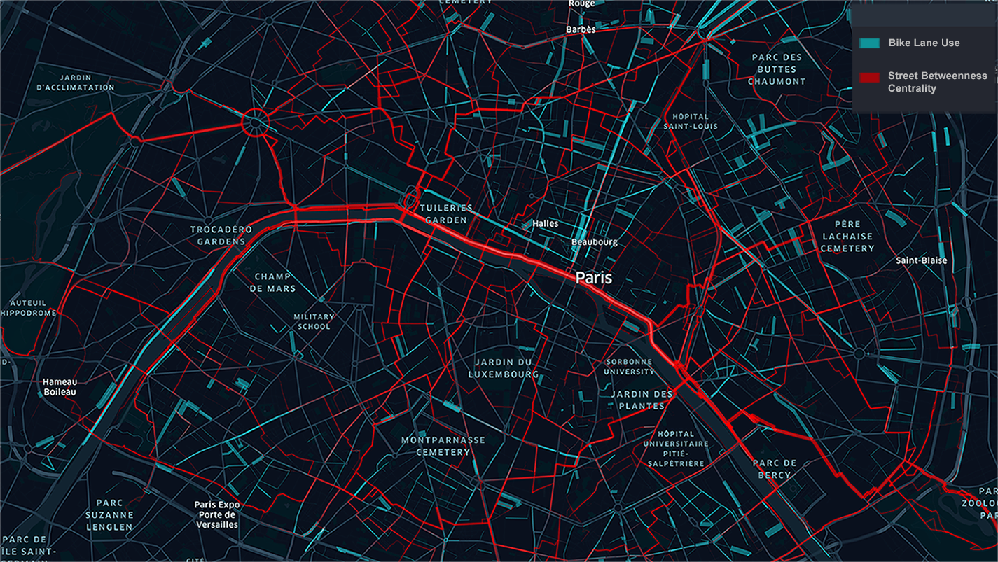
A statistical analysis between the actual flows and flows predicted by betweenness centrality showed a very weak positive correlation. We can visually confirm this mismatch between the actual micromobility counts and the attractiveness of street segments as predicted by betweenness centrality by overlaying and visualising both together on the same map:

A visual inspection shows that although there is an overlap between actual flows and betweenness centrality attractiveness in some street segments along and leading to the Seine river, there are also many street segments with high actual trip counts and a low betweenness centrality, and vice versa. Although this requires further analysis at different geographic scales, our first results demonstrate betweenness centrality and its derivatives as a tool to have a very limited scope and usefulness in evaluating the attractiveness of street segments.
An even more interesting question is whether the existing cycling infrastructure is sufficient in meeting the existing demand for micromobility trips. To understand this, we can identify all street segments that are currently actively used by micromobility devices - bikes, e-scooters, etc., but that are lacking cycling infrastructure. In the below map, we have visualised those segments that have above average (50th percentile) demand for micromobility trips and where there are no biking lanes or paths.

As we can see, the central areas are relatively well equipped with cycling infrastructure, while the outer Arrondissements, especially in the western and north-western parts of the city have significant demand that is not met: a total of approximately 1214 kilometers of missing lanes - more than the existing 1081 kilometers of cycling infrastructure in Paris.
To get a sense of urgency, let's focus on the top 1% of micromobility demand that is currently not met:

As expected, the map is much less cluttered as we have selected the street segments with exceptionally high unmet micromobility demand. An interesting observation is that there are no large swathes of territories lacking infrastructure to meet the top 1% unmet demand. Rather, the top 1% of demand that is currently not met takes the form of spatial islands spread across Paris - a big compliment to the planners. Of particular interest are the clusters of high unmet demand around Place Victor Hugo in the western part of the city, and the residential district Les Olimpiades in the south-east.
Finally, we can group the micromobility demand in Paris that is currently not met by percentile ranges:
1. above 50% of unmet demand - infrastructure needed in the long term
2. above 75% of unmet demand - infrastructure needed in the middle term
3. above 90% of unmet demand - infrastructure needed in the short term
4. above 95% of unmet demand - infrastructure needed as priority
5. above 99% of unmet demand - infrastructure needed urgently
If we now plot the total length of missing infrastructure in each of the above categories, we will obtain the following bar chart:

As we can see, Paris urgently needs approximately just 44 kilometers of additional cycling infrastructure.